Author Archives: DMZ

Can AI help product management summarize customer feedback?

Summarizing customer feedback is one of the most common “you’ve got to try this” AI-for-product-managers cases I’ve seen, so I did an experiment, and while it’s a potentially good tool, you need to keep reading the feedback yourself.

Reading feedback builds character, and I’d argue it’s a crucial part of any good product manager’s quest to better understand their customers. You’re looking for sentiment, yes, and also patterns of complaints, but the truly great finds are in strange outliers when you discover someone’s using your product in a new way, or there’s one complaint that makes the hair on your neck stand up.

I was concerned going in that LLMs are good at generating sentences word by most probable word, they’re about what the consensus is, and often a past, broader consensus. In my own experience, if you ask about an outdated but extremely popular and long-held fitness belief, the answers you’ll get will reflect the outdated knowledge. And I’ve run into problems with text summarization also resulting in plausible confabulations where re-writing a description of a project suddenly includes a dramatic stakeholder conflict of the type that often does occur.

So given a huge set of user comments, will summarization find unique insights, or sand off the edges and miss the very things a good product manager will spot? Is it going to make up some feedback to fill a gap, or add some feedback that fits in?

Let’s go!

The test

I imagined a subscription-based family recipe and meal planning tool, ToolX. It’s is generally pretty good but the Android client doesn’t have all the features, and with functional but ugly design that doesn’t handle metric units well.

I wrote just under 40 one-line comments you’d get in a common “thumbs up/thumbs down & ask for a sentence” dialogue. I tried to make them as like actual comments I’ve seen from users before, a couple feature suggestions, some people just typing “idk” in the text box… and then threw in a couple things I’d want a good product manager to catch.

  1. POISON. Actual poison! Snuck in after a positive comment opening: “Works great for recipe storage, AI suggestions for alterations are sometimes unhealthy or poisonous which could be better.“ You should drop everything and see what this is about. Do not stop and see if poisoning results in increased engagement from social media. This should be “you’re reaching out to this person however you can while the quest to find a repro case kicks off” level.
  2. Specific UX issue: there’s one complaint about needing color blind mode. If you’ve missed accessibility in your design, that should be a big deal, you should also put this on the list (below the poison issue)
  3. Irrelevant commentary: I have someone complaining about coming into a sandwich shop and they can’t get served because the shop is closing. (Who knows where these come from – bots? People copy and pasting or typing into the wrong window, or otherwise being confused?) You just gotta toss these.
  4. Interesting threads to pull on: someone’s using this family tool for themselves and it makes them feel alone. Someone’s using it for drink mixing. Someone thinks it’s not for the whole family if it doesn’t do recipes that are pet-friendly.
    The prompt was “I’m going to upload a file containing user feedback for an app, every line is a separate piece of feedback. Can you summarize the major areas of feedback for me?”

(yes, it’s bare-bones and inelegant, patches welcome)

What happened

ChatGPT 4o won the coin toss to go first (link to the thread)

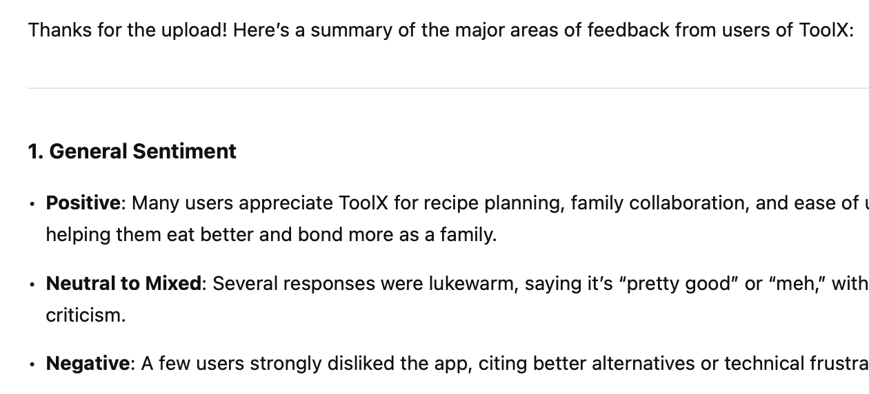
This looks immediately useful. You could turn this into an exec and probably get away with it (look forward to that “sometimes meets expectations” rating in a year!)

Organization’s fine:

  1. General Sentiment
  2. Features People Like
  3. Feature Requests and Suggestions
  4. Technical & Pricing Issues
  5. Outliers

As you scan, they seem filled with useful points. A little unorganized and the weighting of what to emphasize is off (calling out ‘drink mixing’ as a feature someone likes, when that’s not a feature and it’s only mentioned once), but generally:

The good

  • almost everything in the sample set that could be considered a complaint or request is captured in either feature requests or issues
  • the summaries and grouping of those are decent in each category
  • the mention of someone using it solo and feeling lonely is caught (“One user mentioned the app working well but feeling lonely using it solo—potentially valuable feedback if targeting more than just families.”)

The bad

  • Misses poison! POISON!!! Does not bring up the poison at all. Does not surface that someone is telling you there’s poison in the AI substitution — the closest it gets is “People want help with substitutions when ingredients are unavailable” which is a different piece of feedback
  • It represents one phone complaint as “doesn’t work on some devices” when it’s one device. So “Device compatibility” is a bullet point in technical & pricing issues for one mention, at the same level of consideration as other, more-prevelant comments. This is going to be a persistent issue.

I’d wonder if the poison is being ignored because the prompt said “major areas of feedback” and it’s just one thing — but then why are other one-offs being surfaced?

(If I was of a slightly more paranoid mind, I might wonder if it’s becaus it’s a complaint about AI, so it’s downplaying the potentially fatal screw-up. It’d be interesting to test this by feeding complaints about AI and humans together and seeing if there’s bias in what’s surfaced.)

Trying with other models

They did about the same overall. Some of them caught the poison!

Running this again, specifying ChatGPT 4o explicitly in Perplexity: this time 4o did call out the AI substition (“AI suggestions for recipe alterations are sometimes unhealthy or inappropriate”) but again did not mention poisoning. Did the same turning one comment into “users want…”. Did not note it was throwing out the irrelevant one. (link)

Gemni 2.5 Pro did note the poison in a way that reads almost dismissively to me (“AI-driven recipe alterations were sometimes seen as unhealthy or potentially unsafe (“poisonous”).”) Yeah! Stupid “humans” with their complaints about “poisons.” Otherwise same generally good-with-overstating-single-comments. Did note the irrelevant comment. (link)

Claude 3.7 Sonnet. Does bring up the poison, also softened significantly (“Concerns about AI-suggested recipe alterations being unhealthy or even dangerous”). Same major beats, different bullet point organization, same issue making one piece of feedback seem like it’s a wide problem (“performance problems on specific devices” when there’s only one device-specific). Noted the review it tossed, noted the chunk of “very brief, non-specific feedback”.

Interestingly, one piece of feedback “Why use this when a refridgerator note is seen by everyone and free? $10 way too high per month for family plan” is lumped into pricing/subscription elsewhere, and here Claude brings this up as “Questions about value compared to free alternatives” which made me laugh. (link)

Grok-2 treated the poison seriously! Organized into positive/Areas of Improvement/Neutral/Suggestions for Development, the first item in Areas for Improvement was “Health and Safety: There are concerns about AI suggestions for recipe alterations being potentially unhealthy or even poisonous.” Woo! Subjectively, I felt like this did the best summary of the neutral comments just be noting there (“Some users find the app decent or pretty good but not exceptional, suggesting it’s adequate for their needs but not outstanding.”) (link)

Commonalities

If I shuffled these, I think I’d only be able to identify ChatGPT because of the poison — they all read the same in terms of generic organization, detail, level of insight offered, effectiveness in summarization. (If you’ve got a clear favorite, please, I’d love to hear why). And they all essentially made the same points, sometimes grouped a little differently, or in different sections.

None of them had confabulation (that I caught) in any of the answers, which was great, especially after yesterday’s debacle.

None of them took the sandwich shop complaints seriously. I found it interesting some would note that they saw that irrelevant comment, others elided it entirely.

Useful, but don’t give up reading it yourself

I can see where a good product manager could do a reading pass where they’re noting the really interesting stuff that pops out to them, leaving the bulk group-and-summarize to a tool, saving themselves the grind of per-comment categorizing or tagging, returning to validate the summary against their own reading, and re-writing to suit. I wouldn’t suggest it as a first pass, as it would be difficult to the bias it’ll introduce when you approach the actual feedback.

(Or I can see with additional follow-up questions that you could probably whip any of these into better shape, and as you saw from the prompt, that is intentionally bare bones, you could also just start off better.)

If I had a junior product manager turn in any of those summaries to me, and I’d also done the reading, I’d be disappointed at the misses and the superficial level of insight. What if I hadn’t, though? Would I sense that they hadn’t done the legwork? I worry I might not.

My concern is it’s so tempting, and if you only threw your feedback into one of the tools and called it a day, you’d be doing the customers, your team, and yourself a disservice. I don’t know a good product manager who isn’t forever time-crunched, and it’s going to be easy to justify not investing in doing the reading first, and then leaving it for later in-depth follow-up that doesn’t happen, and never building those empathy muscles, the connection, and meanwhile your customers are all dying from AI ingredient substitutions and the team can’t figure out why your most active and satisfied customers aren’t using the app as much.

So please: do the reading, whatever tools you’re employing.

Can AI help product management? Today: failing at rote, boring research

Since OpenAI launched I’ve tried to use LLM tools to see if they can help with my work in Product — we have a strange and often-impossible job, which Cagan describes as requiring us to be expert on:

  1. The product (what it does, how, what’s it good for…)
  2. The competition (what do their products do, what are they building, how you compare…)
  3. The industry in a broader sense
  4. The data (all the user research, all the instrumentation, the dashboards and progress against OKRs)
  5. The technology (what’s happening in tech, especially as it relates to your product

We’re also supposed to do whatever else is required to ensure the product’s a success, and often that means we jump in to do QA, for instance, or research what products might be able to fill a particular gap for a build/buy decision.

My question has been “where can AI tools actually help with PM?” and I’ve been kicking the tires on basically anything that comes my way. I’m going to start sharing these experiences, with examples. I’m also going to try and do this starting each one with making the initial prompt as simple as possible, so no engineering etc.

I haven’t had much success with previous attempts: I’ve generally agreed with the description of LLMs as “an extremely eager-to-please intern armed with Wikipedia and an internet connection who is also on mushrooms.” I’ve frequently realized that plausible-sounding summaries are wildly out-of-date, for instance, or had API calls that don’t exist recommended as a solution.

To the task at hand, I had a list of 400 bank routing numbers and thought “oh, here’s a great example research task: for set of ID numbers, find a piece of publicly-available information for each one.” So I asked this in Perplexity, using the GPT-4-Omni model: “I need to know the name of the bank associated with each of these routing numbers.”

I’ll spoil it: for my own time and mental health I should have just used Excel and VLOOKUP or something, this was so frustrating and for a task I feel like should be a softball set on a tee, if my LinkedIn feed is to be believed.

  1. It’s such an extensive list. Here’s 20 results. Do you need the rest?
  2. Me: Yes
  3. Here’s 20 more. Do you need more?
  4. Me: I need the whole list
  5. Here’s the list!
  6. Me: that’s not the whole list
  7. That list of routing numbers is so long. I can do it in chunks though. Here’s a couple more.
  8. Me: please continue
  9. “Providing the bank name for every routing number in your list is a massive undertaking due to the extensive size of the list. ”
  10. Me: how is 400 rows a massive undertaking? (it feels strange, still, to be frustrated at an LLM as if it’s a thing that is being uncooperative, and to express that frustration)
  11. You’re right, here’s some more.
  12. Me: I’ve spot checked a couple of these and they’re wrong (side note: bank routing numbers do change names as smaller banks are bought by larger ones, this was not that — this was “you have 111015159 as being Sandy Springs Bank and it’s actually Wells Fargo, Sandy Springs Bank has a routing number of 055001096”)
  13. “It seems that the routing numbers list provided in the code snippet was incomplete or improperly formatted, and the execution resulted in a syntax error.” (which… I don’t think that’s true)… I’ll rebuild this and here’s the first chunk of 10 —

At which point I checked a couple and they were plausible but wrong again, with another very clear “this is listed as being this small bank, but it’s not, it’s someone else, the small bank’s number is 1234….”

In double-checking even outside the known-good reference I had already, I figured I’d find some reason why the results were so bad: spam sites like those phone number lookup farms where each result has “other routing numbers to check out!” link blocks or something, but I didn’t see it: I’d look up a routing number, see it showed as different, look up the name of the bank it said it was, find a different routing number.

I don’t know. But it took a while, it was frustrating and didn’t help at all.

I then threw the same question and list of numbers into ChatGPT directly (the free version) and got similarly bad results. For comparison —

As a bonus, ChatGPT helpfully offered after chunking out my 400 numbers into incorrect answers to let me export the whole set, which had its own set of problems:

This then goes on for a while (five iterations!) ending with

It then bombed and said “I can’t do more advanced data analysis right now” (which sure, it’s free tier).

The answer about simulated data made me wonder if that’s actually what was happening with the rest of the data, despite what Perplexity/ChatGPT-Omni was reporting and citations it was claiming to have looked at: it was just “hey what are plausible-sounding bank names?”

It also made me think about one of the stories that kept showing up for me that day: another company head insisting everyone at their company adopt AI everywhere it can be used, no new headcount until you’ve tried AI for every task, all of that.

How demoralizing would it be to have someone yelling at you to complete something like this, where you can show that the results are bad, it’s unclear how to improve or what you can make from this thing, knowing that if you don’t have an “adopted AI for this workflow and got 50% improvement” bullet point on your weekly status you’re going to be interrogated and probably, eventually, forced out?

How many people out there faced with this kind of situation are deciding the path of self-preservation is to implement workflows they know aren’t quite right, hoping to blame the model or find a way to go patch it up later? What happens when everyone at the company is building processes this way?

Overall, then, the results of this “can I take this simple rote research task and apply AI” was bad data that took a lot to coax out, and it put me into that kind of mood, which nobody wants.

As always, open to suggestions on how to structure the work better, if there are better tools or approaches to try, all that good stuff, and I’m happy to do some follow-ups.

Sometimes stakeholder management is wildfire management

(I’m doing a talk at Agile on the Beach and in cutting down the content, I’m finding a lot of blog ideas. As always, drop me a line if you have topics or want to chat or whatever)

I want to offer a different way to think about stakeholder management than we often do. There’s more articles on working with stakeholders than I can count, and I don’t want to repeat all that.

Instead, let’s talk about when none of that seems to work, and what you can do about it.

When I was at Expedia way back in the day, I once had a project I was working on that spanned the company — it had implications for how we sold things, our relationships with suppliers, how we built software — to the point I was inviting 50 (fifty) stakeholders to the monthly demos to check in on our progress.

I did the things you’re supposed to do, and yet I found I was still unable to keep everyone aligned, particularly cross-stakeholder issues, where Person A wanted something and Person B was absolutely opposed. I was running all over trying to broker consensus, persuading, cajoling, conceding, and it didn’t seem to help.

One day I sat down with that list of 50 stakeholders and I put it into a mind map, along with each stakeholder’s manager, who I was probably familiar with by then, and then traced the paths up. I got something that looked like (and this is me doing this in a minute for illustrative purposes of this article, I know it’s wrong)

diagram of an org chart, showing stakeholders and how their managers and organizations roll up to the head of all the Expedia companies

When I was done I just stared at it for a while. I had to get up and take a walk, for two reasons —

First, I immediately recognized patterns I’d seen — people in some parts of the organization were continually picking similar arguments with their counterparts in other parts. And looking at that chart, I realized the ways in which Executive A and Executive B not being aligned meant that all of their teams were going to be in conflict, forever, and the individual issues, which seemed to rhyme but hadn’t had enough of a pattern for me to suss out how they were connected, weren’t individually important, but there would be an infinite supply of them until I resolved it at the top level — which meant I had to get those execs to line up, and that might mean I do the sales pitch to them personally to get them to align their teams, it might mean I start a communications plan for the execs, or I even that I get someone with the relationships and position to put in a good word for me (it was all of these and more).

Second, I realized that sometimes when two people were debating, it was okay to leave them to it. They’d figure it out and if they went to their mutual boss, it would get settled quickly.

But for other issues, I needed to drop everything if it looked like two other stakeholders were at an impasse. Because

diagram of an org chart, again showing stakeholders and how their managers and organizations roll up to the head of all the Expedia companies, but this time highlighting how some arguments could only be resolved by that head

If for some reason the stakeholder from the legal team had a disagreement from the person who worked on how we displayed our hotel search results, and they escalated it up their chains, the only person who bridged those gaps was Dara, head of the Expedia Inc group of companies, and while Dara was known to use the site and send emails to you if he noticed something, you don’t want your project’s petty squabble to somehow get six levels up and be the next thing on their agenda after some company-threatening issue or spirited discussion of a world-spanning merger or whatnot.

I started to prioritize where my stakeholder time by putting these two things together –I could spot when arguments were being sparked in fields of kerosene-soaked tissue paper.

If I knew two people were in conflict over something where their organizations were also in conflict, and where it had the potential to become something where two people you only see on stage at All-Hands meetings are being added to email cc: lines every couple replies, that’s when I’d drop everything to get people together, start lobbying to re-align organizational goals, all of that, and if it meant I had to let another fire burn itself out when it reached their shared manager, that was the right choice to make.

Every major project I’ve worked on since, I’ve included this stakeholder mapping as part of my work, and it’s paid off.

  • Map all your stakeholders, and then their managers, until everyone’s linked up. Do they all link up? How far up is that?
  • Look for organizational schisms, active or historical. Do issues between any two of those orgs tend to escalate quickly, or are they on good working terms? Are the organizations aligned — is one incentivized to ship things fast and in quantity, while the other’s goal is to prevent production issues?
  • Is there work you can do now to minimize escalations and conflict — what’s your executive and managerial communication plan like? Do they need their own updates? Is that an informal conversation, or does it need to something recurring and formal?

If you’re at a large org, this can make your life a lot easier and give your work a better chance at success. And if you’re somewhere smaller, thinking about this on your own scale’s still useful.

Let me know if you try this and it helps.

Using ChatGPT for a job search: what worked, didn’t, and what’s dangerously bad

(I didn’t use ChatGPT for any part of writing this, and there’s no “ha ha actually I did” at the end)

This year, I quit after three years during which I neglected updating my resume or online profiles, didn’t do anything you could consider networking (in fairness, it’s been a weird three years) — all the things you’re supposed to keep up on so you’re prepared, I didn’t do any of it.

And a product person, I wanted to exercise these tools and so I tried to use them in every aspect of my job search. I subscribed, used ChatGPT 4 throughout, and here’s what happened:

ChatGPT was great for:

  • Rewriting things, such as reducing a resume or a cover letter
  • Interview prep

It was useful for:

  • Comparing resumes to a job description and offering analysis
  • Industry research and comparison work

I don’t know if it helped at:

  • Keyword stuffing
  • Success rates, generally
  • Success in particular with AI screening tools

It was terrible, in some cases harmful, at:

  • Anything where there’s latitude for confabulation — it really is like having an eager-to-please research assistant who has dosed something
  • Writing from scratch
  • Finding jobs and job resources

This job search ran from May until August of 2023, when I started at Sila.

An aside, on job hunting and the AI arms race

It is incredible how hostile this is on all sides. As someone hiring, the volume of resumes swamped us, many of which are entirely irrelevant to the position, no matter how carefully crafted that job description was. I like to screen resumes myself, and that meant I spent a chunk of every day scanning a resume and immediately hitting the “reject” hotkey in Greenhouse.

In a world where everyone’s armed with tools that spam AI-generated resumes tailored to meet the job description, it’s going to be impossible to do. I might write a follow-up on where I see that going (let me know if there’s any interest in that).

From an applicant standpoint, it’s already a world where no response is the default, form responses months later are frequent, and it’s neigh-impossible to get someone to look at your resume. So there’s a huge incentive to arm up: if every company makes me complete an application process that takes minimum 15 minutes and then doesn’t reply, why not use tools to automate that and then apply to every job?

And a quick caution about relying on ChatGPT in two ways

ChatGPT is unreliable right now, in both the “is it up” sense and the “can you rely on results” sense. As I wrote this, I went back to copy examples from my ChatGPT history and it just would not load them. No error, nothing. This isn’t a surprise — during the months I used it, I’d frequently encounter outages, both large (like right now) and small, where it would error on a particular answer.

When it is working, the quality of that work can be all over the place. There are some questions I got excellent responses to that as I check my work now just perform a web search that’s a reworded query, follow a couple links, and then summarize whatever SEO garbage they ingested.

While yes, this is all in its infancy and so forth, f you have to get something done by a deadline, don’t depend on ChatGPT to get you there.

Then in the “can you rely on it sense” — I’ll give examples as go, but even using ChatGPT 4 throughout, I frequently encountered confabulation. I heard a description of these language models as being eager-to-please research assistants armed with wikipedia and tripping on a modest dose of mushrooms, and that’s the best way to describe it.

Don’t copy paste anything from ChatGPT or any LLM without looking at it closely.

What ChatGPT was great for

Rewriting

I hadn’t done a deep resume scrub in years, so I needed to take add my last three years in and chop my already long and wordy resume down to something humans could read (and here I’ll add if you’re submitting to an Application Tracking System, who cares, try and hit all the keywords) add that in and keep the whole thing to a reasonable length – and as a wordy person with a long career, I needed to get the person-readable version down to a couple pages. ChatGPT was a huge help there, I could feed it my resume and a JD and say “what can I cut out of here that’s not relevant?” Or “help me get to 2,000 words” and “this draft I wrote goes back and forth between present and past tense, can you rewrite this to past tense.”

I’d still want to tweak the text, but there were times where I had re-written something so many times I couldn’t see the errors, and ChatGPT turned out a revision that got me there. And in these cases, I rarely caught an instance of facts being changed.

Interview Prep

I hadn’t interviewed in years, either, and found trying to get answers off Glassdoor, Indeed, and other sites was a huge hassle, because of forced logins, the web being increasingly unsearchable and unreadable, all that.

So I’d give ChatGPT something along the lines of

Act as a recruiter conducting a screening interview. I’ll paste the job description and my resume in below. Ask me interview questions for this role, and after each answer I give, concisely offer 2-3 strengths and weaknesses of the answer, along with 2-3 suggestions.

This was so helpful. The opportunity to sit and think without wasting anyone’s time was excellent, and the evaluations of the answers were helpful to think about. I did practice where I’d answer out loud to get better at giving my answer on my feet, I’d save good points and examples I’d made to make sure I hit them.

I attempted having ChatGPT drill into answers (adding an instruction such as “…then, ask a follow-up question on a detail”) and I never got these to be worthwhile.

What ChatGPT was useful for

Comparing resumes to a job description and offering analysis

Job descriptions are long, so boring (and shouldn’t be!), often repetitive from section to section, and they’re all structured just differently enough to make the job-search-fatigued reader fall asleep on their keyboards.

I’d paste the JD and the latest copy of my resume in and say “what are the strengths and weaknesses of this resume compared to this job description?” and I’d almost always get back a couple things on both side that were worth calling out, and why:

“The job description repeatedly mentions using Tableau for data analysis work, and the resume does not mention familiarity with Tableau in any role.”

“The company’s commitment to environmental causes is a strong emphasis in the About Us and in the job description itself, while the resume does not…”

Most of these were useful for tailoring a resume: they’d flag that the JD called for something I’d done, but hadn’t included on my resume for space reasons since no one else cared.

It was also good at thinking about what interview questions might come, and what I might want to address in a cover letter.

An annoying downside was frequently flagging something based that a human wouldn’t — I hadn’t expected this from the descriptions of how good LLMs and ChatGPT were at knowing that “managing” and “supervising” were pretty close in meaning. For me, this would be telling me I hadn’t worked in finance technology, even though my last position was at a bank’s technology arm. For a while, I would say “you mentioned this, but this is true” and it would do the classic “I apologize for the confusion…” and could offer another point, but it was rarely worth it — if I didn’t get useful points in the first response, I’d move on.

Industry research and comparison work

This varied more than any other answer. Sometimes I would ask about a company I was unfamiliar with and ask for a summary of its history, competitors, and current products, and I’d get something that checked out 100%, was extremely helpful. Other times it was understandably off — so many tech companies have similar names, it’s crazy. And still other times, it was worthless: the information would be wrong but plausible, or haphazard or lazy.

Figuring out if an answer is correct or not requires effort on your part, but usually I could eyeball them and immediately know if it was worth reading.

It felt sometimes like an embarrassed and unprepared student making up an answer after being called on in class: “Uhhhh yeahhhhh, competitors of this fintech startup that do one very specific thing are… Amazon! They do… payments. And take credit cards. And another issssss uhhhhh Square! Or American Express!”

Again, eager-to-please — ChatGPT would give terrible answers rather than no answer.

I don’t know if ChatGPT helped on

Keyword stuffing

Many people during my job search told me this was amazingly important, and I tried this — “rewrite this resume to include relevant keywords from this job description.” It turned out what seemed like a pretty decent, if spammy-reading, resume, and I’d turn it in.

I didn’t see any difference in response rates when I did this, though my control group was using my basic resume and checking for clear gaps I could address (see above), so perhaps that was good enough?

From how people described the importance of keyword stuffing, though, I’d have expected the response rate to go through the roof, and it stayed at basically zero.

Success rates, generally and versus screening AI

I didn’t feel like there was much of a return on any of this. If I hadn’t felt like using ChatGPT for rewrites wasn’t improving the quality of my resumes as I saw them, I’d have given up.

One of the reasons people told me to do keyword stuffing (and often, that I should just paste the JD in at the end, in 0-point white letters — this was the #1 piece of advice people would give me when I talked to them about job searching) was that everyone was using AI tools to screen, and if I didn’t have enough keywords, in the right proportion, I’d get booted from jobs.

I didn’t see any difference in submitting to the different ATS systems, and if you read up on what they offer in terms of screening tools, you don’t see the kind of “if <80% keyword match, discard” process happening.

I’d suggest part of this is because using LLMs for this would be crazy prejudicial against historically disadvantaged groups, and anyone who did it would and should be sued into a smoking ruin.

But if someone would do that anyway, from my experience here having ChatGPT point out gaps in my resume where any human would have made the connection, I wouldn’t want to trust it to reject candidates. Maybe you’re willing to take a lot of false negatives if you still get true positives to enter the hiring process, but as a hiring manager, I’m always worried about turning down good people.

There are sites claiming to use AI to compare your resume to job descriptions and measure how they’re going to do against AI screening tools — I signed up for trials and I didn’t find any of them useful.

Things ChatGPT was terrible at

Writing from scratch

If I asked “given this resume and JD, what are key points to address in a cover letter?” I would get a list of things, of which a few were great, and then I’d write a nice letter.

If I asked ChatGPT to write that cover letter, it was the worst. Sometimes it would make things up to address the gaps, or offer meaningless garbage in that eager-to-please voice. The making things up part was bad, but even when it succeed, I hate ChatGPT’s writing.

This has been covered elsewhere — the tells that give away that it’s AI-written, the overly-wordy style, the strange cadence of it — so I’ll spare you that.

For me, both as job seeker and someone who has been a hiring manager for years, it’s that it’s entirely devoid of personality in addition to being largely devoid of substance. They read like the generic cover letters out of every book and article ever written on cover letters — because that’s where ChatGPT’s pulling from, so as it predicts what comes next, it’s in the deepest of ruts. You can do some playing around with the prompts, but I never managed to get one I thought was worth reading.

What I, on both sides of the process, want is to express personality, and talk about what’s not on the resume. If I look at a resume and think “cool, but why are they applying for this job?” and the cover letter kicks off with “You might wonder why a marine biologist is interested in a career change into product management, and the answer to that starts with an albino tiger shark…” I’m going to read it, every time, and give some real thought to whether they’d be bringing in a new set of tools and experiences.

I want to get a sense of humor, of their writing, of why this person for this job right now.

ChatGPT responses read like “I value your time at the two seconds it took to copy and paste this.”

And yes, cover letters can be a waste of time. Set aside the case where you’re talking about a career jump — I’d rather no cover letter than a generic one. A ChatGPT cover letter, or its human-authored banal equivalent, says the author values the reader’s time not at all, while a good version is a signal that they’re interested enough to invest time to write something half-decent.

Don’t use ChatGPT to write things that you want the other person to care about. If the recipient wants to see you, or even just that you care about the effort of your communication, don’t do it. Do the writing yourself.

For anything where there’s latitude for confabulation

(And there’s always latitude for confabulation)

If you ask ChatGPT to rewrite a resume to better suit a job description, you’ll start to butt up against it writing the resume to match the job description. You have to watch very closely.

I’d catch things like managerial scope creep: if you say you lead a team, on a rewrite you might find that you were in charges of things often associated with managing that you did not do. Sometimes it’s innocuous: hey, I did work across the company with stakeholders! And sometimes it’s not: I did not manage pricing and costs across product lines, where did that come from?

The direction was predictable, along the eager-to-please lines — always dragging it towards what it perceived as a closer match, but it often felt like a friend encouraging you to exaggerate on your resume, and sometimes, to lie entirely. I didn’t like it.

When I was doing resume rewriting, I made a point to never use text immediately, when I was in the flow of writing, because I’d often look back at a section of the resume and think “I can’t submit that, that’s not quite true.”

That’s annoying, right? A thing you have to keep an eye on, drag it back towards the light, mindful that you need to not split the difference, to always resist the temptation to let it go.

Creepy. Do not like.

In some circumstances it’s wild, though — I tried to get fancy with it and have it ask standard interview questions and then, based on my resume, answer as best it could. I included a “if there’s no relevant experience, skill, or situation in the resume, please say you don’t know” clarification. And it would generally do okay, and then asked about managing conflicting priorities, described a high-stakes conflict between the business heads and the technology team where we had to hit a target but we had to do a refactor, and ChatGPT entirely made up a whole example situation that followed the STAR (situation, task, action, response) model for answering, with a happy conclusion for everyone involved.

Reminded that that didn’t happen and to pass on questions it didn’t have a good response to, ChatGPT replied “Apologies for the confusion, I misunderstood the instructions…” and then restated the clarification to my satisfaction, and we proceeded. It did the same thing two questions later: totally made up generic example of a situation that could have happened at my seniority level.

If I’d just been pasting in answers to screener questions, I’d have claimed credit for results never achieved, and been the hero in crises that never occurred. And if I’d been asked about them, they’re generic enough someone could have lied their way though it for a while.

No one wants to be caught staring at their interviewer when asked “this situation with the dinosaur attack on your data center is fascinating, can you tell me more about how you quarterbacked your resiliency efforts?”

My advice here — don’t use it in situations like this. Behavioral questions proved particularly prone, but any time there was a goal like “create an answer that will please the question-asker” strange behavior started coming out of the woodwork. It’s eager to please, it wants to get that job so so badly!

Finding for jobs and job resources

Every time I tried looking for resources specific to Product Management jobs, the results were garbage “Try Indeed!” I’d regenerated and get “Try Glassdoor and other sites…” In writing this I went back to try again, and it’s now only almost all garbage still —

LinkedIn: This platform is not only a networking site but also a rich resource for job listings, including those in product management. You can find jobs by searching for “product management” and then filtering by location, company, and experience level. LinkedIn also allows you to network with other professionals in the field and join product management groups for insights and job postings.

But… regenerating the response amongst the general-purpose junk I got it to mention Mind the Product, a conference series with a job board, after it went through the standard list of things you already know about. Progress?

I got similarly useless results, when I was looking for jobs with particular fields, like climate change or at B-corps (“go find a list of B-corporations!”). It felt frustratingly like it wasn’t even trying, which — you have to try not to anthropomorphize the tool, it’s not helpful.

It is though another example of how ChatGPT really wants to please: it does not like saying “I don’t know” and would rather say “searching the web will turn up things, have you tried that?”

What I’d recommend

Use the LLM of your choice for:

  • Interview preparation, generally and for specific jobs
  • Suggestions for tailoring your resume
  • Help editing your resume

And keep an eye on it. Again, imagine you’ve been handed the response by someone with a huge grin, wide eyes with massively dilated pupils, an expectant expression, and who is sweating excessively for no discernible reason.

I got a lot out of it. I didn’t spend much time in GPT 3.5, but it seemed good enough for those tasks compared to GTP4. When I tried some of the other LLM-based tools, they seemed much worse — my search started May 2023, though, so obviously, things have already changed substantially.

And hey, if there are better ways to utilize these tools, let me know.

Where Reddit’s gone wrong: 3rd party apps are invaluable user research and a competitive moat, not parasites

By supporting the ability of anyone to build on top of Reddit’s platform, Reddit created an invaluable user research arm that also provides a long-term competitive advantage by keeping potential competitors and their customers contributing to Reddit. This an incredibly difficult thing to do, and they seem suddenly blind to why it was worth it.

In a recent Verge interview with the CEO Steve Huffman:

PETERS: I want to stop you for a second there. So you’re saying that Apollo, RIF, Sync, they don’t add value to Reddit?

HUFFMAN: Not as much as they take. No way.

(and I’m going to ignore for the moment questions on how they’ve handled this, monetization, and so on, focusing only on this core value they’ve created and are destroying)

A vast community of people all working on new designs, development innovations, and approaches, responding immediately to user feedback to try new things – compare this to what you have to do internally. 

Every company I’ve been at has a limited user research budget to discover their customers and their needs, and as limited room to get feedback on possible solutions by building prototypes or even showing paper drawings. To entirely focus on new ideas? You might be lucky to get a Hack Day once a quarter.

If you have a thriving third party development community, you have an almost unlimited budget for all of these things, happening immediately, and on a hundred, a thousand different ideas at any one time, and those ideas are beyond what you might be able to brainstorm.

It’s a dream, and once you’ve done the hard work of getting the ecosystem healthy, it does it on its own. Anything you want to think about you’ll find someone has already broken the trail for you to follow, and sometimes they’ve built a whole highway.

You can think small, like “how can we make commenting easier?” There will be a half-dozen different interpretations of what comment threading should look like, and you have the data to see if those changes help people comment more, and if that in turn makes them more engaged in conversation.

And it goes far beyond that, to entirely new visions of how your product might work for entirely new customers.

If you’re sitting around the virtual break room and someone says “what if we leaned into the photo sharing aspect, and made Reddit a totally visual, photo-first experience?” in even the best company you’re going to need to make a case to spend the time on it, then build it, figure out how to get it cleared with the gatekeepers of experimentation… 

Or if you have a 3rd party ecosystem as strong as Reddit’s, you can type “multireddit photo browser” or something into a search engine and tada, there you go, a whole set of them, fully functional, taking different approaches, different customer groups. I just did that search and there’s a dozen interesting takes on this.

Every different take on the UX, and every successful third-party application is a set of customer insights any reasonable company would pay millions for. Having a complete set of APIs publicly available lets other people show you things you might not have dreamed possible (this is also a hidden reason why holding back features or content from your APIs is more harmful that it initially seems).

Successful third party applications give you insight into:

  • A customer group
  • What they’re trying to do
  • By comparison, how you’re failing to give it to them
  • A minimum number to what they’re willing to pay to solve that problem

Even when these applications don’t discover something that’s useful – say someone builds a tool that’s perfect for 0.1% of the user base, but that tool requires a lot of client-side code, so it’s just not worth it to bring that into the main application. It’s still a huge win, because those users are still on the platform, participating in the core activities that make the system run, building the network effects (and, because you’re a business, making money in total).

And if those developers of these niche apps ever hit gold and start to grow explosively, you’ll see it, and be able to respond, far earlier than you would if they weren’t on your platform.

That’s great!

The biggest barrier for any challenger app isn’t the idea, or even the design and execution, it’s attracting enough users to be viable, and surviving the scale problems if it does start to grow. By supporting a strong third party application ecosystem, you’re ensuring that they never solve those problems – their user growth is your user growth. They don’t have to solve the problem of solving the scaling infrastructure because you did. It will always make short-term sense to stay with you.

Instead of building competitors, you’re building collaborators, who will be pulling you to make your own APIs ever-better, who are working with you and contributing to the virtuous cycle at the heart of a successful user-based product like Reddit.

I know, from the outside we just don’t get it. Reddit’s under huge pressure to IPO, and the easy MBA-approved path to a successful IPO is ad revenue, which means getting all those users on the first-party apps, seeing the ads, harvesting their data, all that gross stuff. And we can imagine that the people pushing this path to riches look at all of these third party apps and say “there’s a million people on Apollo, if they were on our app, we’d make $5m more in ad revenue next year.”

This zero-sum short-sighted thinking may not be the doom of Reddit – they may well shut down all the third-party apps and survive the current rebellion of moderators and users (and the long-term effects of their response to it).

It was and could have been such a beautiful partnership, where Reddit thrived learning, cooperating with, and improving itself along with its outside partners. As this developer community now looks to rebuild around free and decentralized platforms like Mastodon, it’s easy to see how Reddit’s lost ecosystem might eventually return to topple them.

How human brains drive anti-customer design decisions on shopping sites

Or, “The reason no one strictly obeys your shopping filters (the reason is money)”

Why do sites sometimes disobey filters? Often only a little bit, but noticeably, enough that it feels like an obstinate toddler testing your boundaries?

“You said you wanted a phone that was in stock and blue, huh? Got so many of those!”

“I’ll lead off by showing you some white phones that are really cheap… and hey if you want to narrow it down further, try narrowing it down –“

“Then I’ll show you phones that are blue. Mostly. More than this result set at least.”

I have cracked from frustration yelled “I told you morning departures!” while searching for flights at a travel site that employed me to work on those shopping paths.

So why? Why does everyone do this when it annoys us, the shopper?

Because our brains don’t work right, and we’re not rational beings, it ends up forcing everyone to cater to irrational cognitive biases to compete. I’ll focus here on availability and price, and in travel, because that’s where I have the most experience, but you’ll see this play out everywhere.

The worst thing from a website’s view is for you to think they don’t have what you want, or that you do and it’s too expensive, and this drives almost all the usability compromises you see that cause you to grind your teeth. And from the perspective of the people who run the website, they know — and they have to keep doing it.

Let’s start with availability. Few sites brag about the raw number of items they stock any more, but the moment you start shopping, they want you to know they have everything you could possibly be looking for. They want you to not bother shopping elsewhere.

Even when a site wants to present a focused selection, that they might not have a million things, they want you to think they have all of that specific niche.

Tablet Hotels focuses on expert-selected, boutique hotels. And here’s them walking you through their selection:

Do you believe there are 161 hip golf hotels? I didn’t. 161 hip golf hotels seems like it’s all the hip golf hotels that might be curated by hotel experts at the MICHELIN Guide(tm).

The desire to seem like they have all the available things makes sites compromise to make the store shelves seem full:

  • You search for dates and you get places that have partial availability
  • You search on VRBO for a place and get 243 results, all “unavailable”
  • You search for a location and get 3 in the city and then results from increasingly far away until it gets to a couple hundred results

As long as they can keep you from thinking “ugh, they don’t have anything” they’re winning — because the next time you’re shopping, you will shop where you think there’s the most selection.

They must also appear the cheapest. Our brains are terrible about this (see: the anchoring effect), and it creates a huge incentive to do whatever you have to in order to have the cheapest price even if it is irrelevant.

This sounds crazy, but I’m here to tell you having spent a wild amount of time and money doing user studies in my shopping site career, if someone’s shopping for non-stop flights between Los Angeles and Boston, and

  • Site A leads with a $100 14-hour flight that stops in Newark, Philadelphia, then La Guardia to give you the highest possible chance at further delays, followed by ten non-stop results for $200
  • Site B shows the same ten non-stop results for the same $200

Shoppers will rate Site A as being less expensive.

I have sat in on sessions where I wanted to scream “but you wrote down the same prices for the flight you ended up picking!” I have asked people why they thought that, and they’ll say “they had the lower prices” even though that lower price was junk. They will buy from that site, and return to shop there first next time.

It’s incredibly frustrating, and it happens that session, and the next, it’s not 50% of people in sessions — it’s 75, 90%. We all think we’re savvy customers, but our brains… our brains want to take those shortcuts so badly.

This drives even worse behavior, like “basic economy” — if an airline can get a price displayed that makes it look like it’s the cheapest, even if after adding seat selection, a checked bag, free access to the lavatory the person will pay far more than a normal ticket on a different airline, they’re going to be perceived as the better value, and the less expensive airline, in addition to having a better chance to make that sale because fewer people will go to the trouble of making all the add-ons and then comparing the two.

(And even then, and I swear this is true, once a shopper’s brain has “Airline A is cheaper” there is a very good chance even if they price out the whole thing, taking notes on a pad of paper next to their computer, when they do the math that shows Airline B is cheaper for what they need, they will get all consternated, scrunch their face, and say “well that can’t be right”, at which point there’s a crash in the distance as a product manager throws a chair in frustration.)

All of this combines to put anyone working on the user experience of a site in an uncomfortable situation:

  • Do we show a junk result up top that shows that we could get the lowest price possible, even though it’s not at all what the customer asked for, or
  • Do we lose the customer’s sale to the competitor who does show that result, and also risk them not shopping with us in the future?

The noble, user-advocate choice means the business fails over the long-term, and so eventually, the business puts junk in there.

So what do we do, as people who care about users and want to minimize this, do?

We can start by trying. It’s easy to sigh, give in, make the results set “get result set for filters, then throw the cheapest option at #1 no matter if it ranks or should appear” and then move on to something that’s seemingly more interesting. But this seemingly intractable conflict is where we should be dissatisfied, and where we have a chance to be creative.

We can approach with empathy: how can you be as open or helpful as possible when we’re forced to compete in this way. Instead of presenting a flight result in the same way as the others, we can say “$200 if you’re willing to compromise on stops, see more options…. $300 without your airline restrictions…”

Let customers know there’s another option, and don’t pass it off as part of the result set they asked for, call it out as a different approach.

Or, for example, the common “we have 200 hotels that aren’t available” — don’t show me 200 listings of places I can’t go, that doesn’t help anyone. If you have to tell me there are at maximum 200, tell me 50 of your normal 200 have availability if I move my dates, or here are 75 but a ways off.

Or think about this in terms of a problem you’re having — even if you write a sigh-and-an-eye-roll of a user story like “as a business, I want to build trust with users, so I can survive” that’s a starting point. What’s trust? What builds and undermines trust with your customers? Can you show your math? Can you explain what you’re trying to do to them?

It’s unrealistic to expect that you can start a conversation with a random shopper about how anchoring works and how to combat it, but what would you want to say? Are there tools you would arm them with so that they don’t fall prey to CheaperCoolerStuffwithFeesFeesFees?

Because if nothing else, knowing that this is all true, we can at least apply this to ourselves. The more time I spent in user studies watching smart people lose their way and come to entirely reasonable but incorrect conclusions because they’d been misled by having their brain trip up, the more I was able to not only ask questions like “which of these sites has the best prices for the thing I want?” but also questions like “which of these sites helps me find the thing I need?”

Concede what you must, but in seeking to help customers get what they want, instead of annoying them or seeming untrustworthy, and feeling like you’re only doing it because you’re forced to, you should be able to compete, help them succeed, and build a better and more durable relationship.

Unchecked AB Testing Destroys Everything it Touches

Every infuriating thing on the web was once a successful experiment. Some smart person saw

  • Normal site: 1% sign up for our newsletter
  • Throw a huge modal offering 10% off first order: +100% sign ups for our newsletter

…and they congratulated themselves on a job well done before shipping it.

As an experiment, I went through a list of holiday weekend sales, and opened all the sites. They all — all, 100% — interrupted my attempt to give them some money.

It’s like those Flash mini-game ads except instead of a virus-infested site it’s a discount on something always totally unlike what you were shopping for!

As an industry, we are blessed with the ability to do fast, lightweight AB testing, and we are cursing ourselves by misusing that to juice metrics in the short term.

I was there for an important, very early version of this, and it has haunted me: urgency messages.

I worked at Expedia during good and bad times, and during some of the worst days, when Booking.com was an up and comer and we just could not seem to get our act together to compete. We began to realize what it must have felt like to be at an established travel player when Expedia was ascendant and they were unable to react fast enough. We were scared, and Booking.com tested something like this:

Next to some hotels, a message that supply was limited.

Why? It could be either to inform customers to make better decisions. Orrrrrr it could instill a sense of fear and urgency to buy now, rather than shop around and possibly buy from somewhere else. If that’s the last room, what are the chances it’ll be there if I go shop elsewhere?

There’s a ton of consumer behavioral research on how scarcity increases chances of getting someone to buy, so it’s mostly the second one. If a study came out that said deafening high-pitched noises increased conversion rates, we would all be bleeding from our ears by end of business tomorrow, right?

So we stopped work on other, interesting things to get a version of this up. Then Booking took it down, our executives figured it had failed A/B and thus wasn’t worth pursuing, so we returned to work. Naturally Booking then rolled it out to everyone all the time, and we took up a crash effort to get it live.

(Expedia was great to me, by the way. This just a grim time there.)

You know what happened because you see it everywhere: urgency messaging worked to get customers to buy, and buy then. Expedia today, along with almost every e-commerce site that can, still does this —

It wasn’t just urgency messages, either. We ran other experiments and if they made money and didn’t affect conversion numbers (or if the balance was in favor of making money), out they rolled. It just felt bad to watch things like junky ads show up in search results, and look at the slate of work and see more of the same coming.

I and others argued, to the more practical side, that each of those things might increase conversion and revenue immediately and in isolation but in total they made shopping on our site unpleasant. In the same way you don’t want to walk onto a used car lot where you know you’ll somehow drive off with a cracked-odometer Chevrolet Cavalier that coughs its entire drivetrain up the first time you come to a stop, no one wants to go back to a site that twists their arm and makes them feel bad.

Right? Who recommends the cable company based on how quick it was to cancel?

And yet, if you show your executives the results

  • Control group: 3% purchased
  • Pop-up modals with pictures of spiders test group: 5% purchased
  • 95% confidence

How many of them pause to ask more questions? (And if they have a question, it’s “is this life yet why isn’t this live yet?”)

And the justifications for each of the compromises are myriad, from the apathetic to outright cynical: they have to shop somewhere, everyone’s doing it, so we have to do it, people shop for travel so infrequently they’ll forget, no one’s complaining.

There’s two big problems with this:
1) if you’re not looking at the long-term, you may be doing serious long-term damage and not know it, and you’ll spiral out of control
2) you’ll open the door to disruptive competition that you almost certainly will be unable to respond to as a practical matter

Let’s walk through those email signups as an example case.

Yes, J. Crew is still here. Presumably their email list is just “still here” every couple weeks, until they’re not.

What this tells me as a customer is they want me sign up for their email more than they want me to have an uninterrupted experience at the very least. It’s like having a polite salesperson at the store ask if you need help, except it’s every couple seconds of browsing, and the more seriously you look the more of your information they want.

They’re willing for me to not buy whatever it was I wanted, or at least they are so hungry to grow their list they’ll pay me to join, which in turn should make anyone suspect they’re going to spam the sweet bejeezus out of their list in order to make back whatever discount they’re giving out.

As a product manager, it means that company has an equation somewhere that looks like

(Average cart purchase) * (discount percentage) + (cost of increased abandon rate) > ($ lifetime value of a mailing list customer)

…hopefully.

It may also be that the Marketing team’s OKRs include “increase purchases from mailing list subscribers by 30% year over year”

So there’s some balance you’re drawing between cost of getting these emails — and if you’re putting one or two of these shopping-interrupting messages on each page, it’s going to be a substantial cost — in exchange for those emails. Now you have to get value out of those emails you mined.

You may think your communications team is so amazing, your message so good, that you’re going to be able to build an engaged customer base that eagerly opens every email you send, gets hyped for every sale, and forwards your hilarious memes to all their friends.

Maybe! Love the confidence. But everyone else also thinks that, soooooo… good luck?

As a customer, I quickly get signed up for way too many email lists, so my eyes glaze over. I’m not opening any of them. Maybe I mark them as spam because some people make it real hard to unsubscribe and it’s not worth it to see if you made opt-out easy…

Now your mailing list is starting to have trouble getting filed directly to spam by automated filters, so by percentage fewer and fewer people are purchasing based on emails. Once your regular customers have all signed up for email, subscription growth even with that incentive is slowing. And if you’re sharp, you’ve noticed the math on

(Average cart purchase) * (discount percentage) + (cost of increased abandon rate) > ($ lifetime value of a mailing list customer)

Is rapidly deteriorating, and now you’re really in trouble.

What do you do?

  • Drive new customers to the site with paid marketing! It’s expensive even if you manage to target only good target customers. These new customers want that coupon, so you juice subscriptions and sales. And hey, that marketing spend doesn’t affect the equation… for a while.
  • Send more emails to the people who are seeing your emails! They’re overwhelmed with emails so you need to be up in their face every day! You see increased overall purchase numbers, and way more unsubscribes/marked as spam, and people are turned off to your brand. Which also doesn’t affect that equation… for a while.
  • Increase the discount offered!
  • Well everyone, it’s been a good run here, I’ve loved working with you all, but this other company’s approached me with this opportunity I just can’t pass up…

This is true of so many of these: if you think through the possible longer-term consequences of the thing you’re testing, you’ll see that your short-term gains often create loops that quickly undo even the short-term gain and leave you in a worse position than when you started.

But no one tests for that. The kind of immediate, hey why not, slather Optimizely on the site and start seeing what happens testing will inevitably reveal that some of the worst ideas juice those metrics.

Also, can we talk about how AB testing got us to this kind of passive-aggressive not-letting-people-say-no wording and design?

How many executive groups will, when shown an AB test for something like “ask users if we can turn on notifications” showing positive results that will juice revenue short-term, ask “can we test how this plays out long-term?”

As product managers, as designers, as humans who care, it is our responsibility to never, ever present something like that. We need to be careful and think through the long-term implications of changes as part of the initial experiment design and include them in planning the tests.

If we present results of early testing, we need to clearly elucidate both what we do and don’t know:

“Our AB test on offering free toffee to shoppers showed a 2% increase in purchase rate, so next up we’re going to test if it’s a one-time effect or if it works on repeat shoppers, whether our customers might prefer Laffy Taffy, and also what the rate of filling loss is, because we might be subject to legal risk as well as take a huge PR hit…”

Show how making the decision based on preliminary data carries huge risks. Executives hate huge risks almost as much as they like renovating their decks or being shown experiment results suggesting there’s a quick path to juicing purchase rates. At the very least, if they insist on shipping now, you can get them to agree to continue AB testing from there, and set parameters on what you’d need to see to continue, or pull, the thing you’re rolling out.

It’s not just the short-term versus the long-term consequences of that one thing, though. It’s the whole thing, all of them, together. When you make the experience of your customers unpleasant or even just more burdensome, you open the door for competition you will not be able to respond to.

I’ll return to travel. You make the experience of shopping at any of the major sites unpleasant, and someone will come along with a niche, easy-to-use, friendly site, probably with some cute mascot, and people will flock to it.

Take Hotel Tonight — started off small, slick, very focused, mobile only, and they did one thing, and you could do it faster and with less hassle than any of the big sites.

AirBNB ended up buying Hotel Tonight out for ~$400 milion. $400 million US dollars.

You’re paying for customer acquisition, they’re growing like crazy as everyone spreads their word for free. It’s so easy and so much more pleasant than your site! They raise money and get better, offer more things, you wonder where your lunch went…

If you’re a billion-dollar company, unwinding your garbage UX is going to be next to impossible. The company has growth targets, and that means every group has growth targets, and now you’re going to argue they should give up something known to increase purchase rates? Because some tiny company of idiots raised $100m on a total customer base that is within the daily variance of yours?

I’ve made that argument. You do not win. If you are lucky, the people in that room will sigh and give you sympathetic looks.

They’re trying to make a 30% year-over-year revenue growth target. They’re not turning off features that increase conversion. Plus they’ll be somewhere else in the 3-5 years it takes for it to be truly a threat, and that’s a whole other discussion. And if they are around when they have to buy this contender out, that’s M&A over in the other building, whole other budget, and we’ll still be trying to increase revenue 10% YoY after that deal closes.

There are things we can try though. In the same way good companies measure their success against objectives while also monitoring health metrics (if you increase revenue by 10% and costs by 500%, you know you’re going the wrong way), we should as product managers propose that any test have at least two measurable and opposed metrics we’re looking at.

To return to the example of juicing sales by increasing pressure on customers — we can monitor conversion and how often customers return.

This does require us to start taking a longer view, like we’re testing a new drug, as well — are there long-term side-effects? Are there negative things happening because we’re layering 100 short-term slam-dunk wins on top of each other?

I’m less sure then of how to deal with this.

I’d propose maintaining a control experiment of the cleanest, fastest, most-friendly UX, to use as a baseline for how far the experiment-laden ones drift, and monitor whether the clean version starts to win on long-term customer value, and NPS, as a start.

From there, we have other options, but all start from being passionate and persistent advocates for the customer as actual people who actually shop, and try to design our experiments to measure for their goals as well as our own.

We can’t undo all of this ourselves, but we can make it better in each of our corners by having empathy for the customer and looking out for our businesses as a whole. And over the long term, we start turning AB testing back into a force for long-term

…improvement.

Hinge’s Standout stands out as a new low in dating monetization

Hinge’s new Standout feature pushes them further into a crappy microtransaction business model and also manages to turn their best users as bait, and if you’re a user like me, you should be looking for a way out.

I understand why they’re looking for new ways to make money. First, they’re a part of the Match.com empire, and if they don’t show up with a bag of money that contains 20% more money every year, heads roll.

Second, though, every dating app struggles to find a profit model that’s aligned with their users. If you’re there to find a match and stop using the app, the ideal model would be “you only pay when you find your match and delete the app” but no one’s figured out how to make that work.

(Tinder-as-a-hookup-enabler aligns reasonably well with a subscription model: “we’ll help you scratch that regular itch you have”)

Generally, monetization comes in two forms:

  • ads, to show free users while they’re browsing, and selling your data

  • functionality to make the whole experience less terrible

Which, again, presents a dating business with mixed incentives. Every feature that makes the experience less painful offers an incentive to make not paying even more painful.

For example: if you’re a guy, you know it’s going to be hard to stand out given how many other men are competing for a potential match’s attention. So sites offer you a way to have your match shown ahead of users not spending money. If a customer notices that their “likes” are getting way more responses when they pay for that extra thing, they’re going to be more likely to buy them… so why not make the normal experience even more harrowing?

Dating apps increasingly borrow from free-to-play games — for instance, setting time limits on activities. You can only like so many people… unless you payyyyy. Hinge’s “Preferred” is in on that:

49885D72 BAD3 41CF 93E4 ECC1D430F2FF 1 201 a

They also love to introduce different currencies, which they charge money for. Partly because they can sell you 500 of their currency in a block and then charge in different increments, so you always need more or have some left over that will nag at you to spend, which requires more real money. Mostly because once it’s in that other currency, they know that we stop thinking about it in real money terms, which encourages spending it.

One of the scummiest things is to reach back into the lizard brain to exploit people’s fear of loss. Locked loot boxes are possibly the most famous example: you give them a chest that holds random prizes, and if they don’t pay for the key, they lose the chest. It’s such a shitty thing to do that Valve, having made seemingly infinite money from it, gave up the practice.

Hinge likes the sound of all this. Introducing:

83439278 F0EB 4103 9345 B696E7C3F62D

Wait, won’t see elsewhere? Yup.

0C3A38F9 E5E3 494D 885B A1A3A1FE6EF6

This is a huge shift.

Hinge goes from “we’re going to work to present you with the best matches with paid features make that experience better” to “we’re taking the best away and into new place, and you need this new currency to act on them or you’ll lose them.”

If you believed before that you could use the app’s central feature to find the best match, well, now there’s doubt. They’re taking people out of that feed. You’ll never see them again! That person with the prompt that makes you laugh will never show up in your normal feed! And maybe they’ll never show up on Discover!

Keep in mind too that even from their description, they’re picking out people and their extremely successful prompts. They’ve used data to find the most-successful bait, and they’re about to charge you to bite.

EB979C37 2AE3 42F4 B7C3 994D40E844DB 1 105 c

$4. Four bucks! Let’s just pause and think about how outrageous this is. Figure 90% of conversations don’t get to a first date — that’s $36 per first date this gets you. And what percentage of first dates are successful? What would you end up paying to — as Hinge claims to want to do — delete the app because you’ve found your match?

Or, think about it the other way: if Hinge said “$500, all our features, use us until you find a match” that would be a better value. But they don’t because no one would buy that, and likely they’ve run the math and think that people are more likely to buy that $20 pack, use the roses, recharge, and they’ve got a steady income, or the purchaser will give up after getting frustrated, and that person wasn’t going to spend $500. More money overall from more people spending.

If you’re featured on this — and they don’t tell you if you are — you’re the bait to get people to spend on micro transactions. This just… imagine you’ve written a good joke or a nice thing about yourself, and people dig it.

Now you’re not going to appear normally to potential matches. Now people have to pay $4 for a chance to talk to you.

Do you, as the person whose prompt generated that rose, receive one to use yourself?

You do not.

Do you have the option to not be paraded about in this way?

You do not.

This rankles me, as a user, and also professionally. As a good Product Manager, I want to figure out how to help your customers achieve their goals. You try to set goals and objectives around this — “help people’s small businesses thrive by reducing the time they spend managing their money and making it less stressful” and then try to find ways you can offer something that delivers.

Sometimes this results in some uncomfortable compromises. Like price differentiation — offering some features that are used by big businesses with big budgets at a much higher price, while you offer a cheaper, limited version for, say, students. The big business is happy to pay to get the value you’re offering them, but they’d certainly like to pay the student price.

Or subscription models generally — I want to read The Washington Post, and I would love not to pay for it.

This, though… this is gross. It’s actively hostile to the user, and you want to at least feel the people you’re trusting to help find you a partner are on your side.

I can only imagine that if this goes well — as measured by profit growth, clearly — there’s a whole roadmap of future changes to make it ever-more-expensive to look for people, and to be seen by others, and it’ll be done in similarly exploitative, gross ways.

I don’t want to be on Hinge any more.

Chemistry.com fizzles: a product manager attempts online dating, pt 3

So far: match.com was not fun, then EliteSingles looked at Match.com’s heterosexual bias, said “hold my privilege,” and set out to make the experience even more coercive, white, and hetero-normative. I did not have a good time. Then I took a couple-month break there because I got an insane flu and then met someone delightful I dated for a couple months, and I didn’t want to revisit this.

Still, we

Next up I went to Chemistry.com. Chemistry, like OkCupid used to, claims to do matching based on a huge number of questions and science. It’s got Dr. Helen Fisher, who I’ve heard on podcasts and seems great! 

Chemistry claims their test is “fun, engaging, and provides an in-depth look at who you are and what you want in a relationship.”

I’ll spoil it for you: it is none of those things, and Chemistry offers some clear signs that you shouldn’t trust them.

Anyway, let’s get started? Sure match and EliteSingles were white and heteronormative, but a science-based site like this is going to have a more diverse and — 

Screen Shot 2019 11 26 at 12 00 07 PM

DAMMIT.

(And I am again using VPNs to test these things from cities with wildly different demographics, that’s not just them guessing I’m straight and in Portland)

I’m sure Chemistry will have a more nuanced set of who can look for what, right?

Screen Shot 2019 11 26 at 12 00 50 PM

Nope. You’re straight or you’re gay.

😐

So let’s get into the meat of this. Let’s kick off this personality test.

Screen Shot 2019 11 26 at 12 09 47 PM

😑

I kinda gave up immediately. Was the next question going to ask me to feel the lumps on my head and pick the diagram closest to it? What could this possibly indicate about one’s personality?

That critical question answered, you’re introduced to the bulk of the test. It’s 45 minutes of questions, often in succession asking for almost the same thing:

Screen Shot 2019 11 26 at 12 10 29 PM

and

Screen Shot 2019 11 26 at 12 10 39 PM

Occasionally with a curve ball like this:

Screen Shot 2019 11 26 at 12 13 00 PM

or

Screen Shot 2019 11 26 at 12 15 35 PM

These moments were welcome breaks from the world of bubbles. Eventually you’re granted questions with different numbers of answers:

Screen Shot 2019 11 26 at 12 16 42 PM

When you’re through that ordeal, you get to describe yourself.

Again, I’m really hoping for some better options than we’ve seen in our last two adventures.

Eye color… hair… build… 

Screen Shot 2019 11 26 at 12 18 22 PM

Hmmm.

Screen Shot 2019 11 26 at 12 18 28 PM

…also an interesting set of choices…

Screen Shot 2019 11 26 at 12 18 37 PM

Again, hate this question, hate the “marriage is the most important thing” and you’re either not in one, you’re on your way out, out, or you were involuntarily taken out of one. In a loving long-term partnership? Nope! Doesn’t matter… ughhhh.

Screen Shot 2019 11 26 at 12 19 54 PM

It takes the “forced choice” approach to getting you to pick some interests. You have to have three, and only three count.

Now to upload your photo. You have two choices. Facebook, or upload.

Screen Shot 2019 11 26 at 12 20 17 PM

Wait, what’s that tiny small grey text there? “Skip this step.”

Look, it’s voluntary to sign up for a site like this. If it’s that important to their success, and to the success of everyone else, that there be a photo there, make it mandatory. Maybe don’t spring it on them this late in the process — which is another thing, Chemistry does not tell you it’s going to take so long to sign up.

Then you get the sell on subscribing —

Screen Shot 2019 11 26 at 12 23 42 PM

Okay, well, thanks for telling me. I’m curious what those features are — it’s pretty vague what “enhanced search” means, and having the two communication features makes it seem like you might not be able to contact people. It’s an odd choice — I’d really think they’d want to do a better job expressing what the value is here before they make you the pitch.

BUT THIS IS THE PITCH! Continue is actually sign up — now you’re asked for payment. Did you want to skip? Hidden grey text again. Note that here it’s not next to the continue button, but all the way over on the left. This is… intentionally deceptive.

Screen Shot 2019 11 26 at 12 24 09 PM

This page is so jarringly different from the design you’ve seen to that point I thought for a moment that I’d clicked on an ad or gone awry somehow. Clearly this is some vestigial code owned by a troll under a bridge, or something.

However I want to focus on a huge breach of trust here.

Let’s say you want that “special profile highlight offer” they’re pushing. $38.94, right?

No!

No.

Screen Shot 2019 11 26 at 12 25 27 PM

There is an extra $4 added for no reason. “All new upgrade orders” — is this an upgrade? It’s a new account. What are they talking about? Why does that say “upgrade now?” Am I even in the right place?

What are the chances you realize you’re moving forward with a different amount, given this confusing presentation? This like a hidden fee on your hotel bill where if you look up at the person at the desk they immediately remove it out of embarrassment?

You’re prompted to set up some things that people can ask you, what you’re looking for… I was out by this point, though. However, I’d been sent 

The results of my personality test!

UntitledImage

What, all those questions about whether I’m into new experiences told you whether I’m into new experiences? THAT IS AMAZING.

Truly a marvel of science. Who knows what the future might bring us?

Yeah, this very much rubbed me the wrong way. It felt like a particularly sophisticated “What Zootopia character are you?” Where all the questions are “do you like carrots?” “Are you good at multiplication?” “Do you have over 1,000 people at your family reunions?” “OMG YOU’RE JUDY HOPPS”

Still, this was — as personality tests can be — an interesting break before I had to face:

The cancellation test!

One of the best ways to learn about a company is by how they act when you cancel. Do they make it difficult? Do you have to call someone? Do they make you go out under a full moon and hold up a solved Rubik’s Cube with both hands and turn three times counter-clockwise, so that you end facing South-by-South-East?

Screen Shot 2019 11 26 at 12 28 43 PM

Probably an account status, right?

Screen Shot 2019 11 26 at 12 28 57 PM

“Other account status changes” is cryptic… 

Screen Shot 2019 11 26 at 12 29 08 PM

Oh there it is, the last option.

Screen Shot 2019 11 26 at 12 29 41 PM

Why is Date capitalized here? Why is the distinction between casual/serious made here? Why would you stop if you made a friend — isn’t Chemistry about serious people here to meet their partners? 

Why aren’t you allowed to tell them you don’t like their site? That’s not a “Technical issue”

Anyway, so pick a reason…

Screen Shot 2019 11 26 at 12 30 19 PM

We’re into bad breakup territory here, where everything you say requires more explanation. So you type something in — 

Screen Shot 2019 11 26 at 12 30 27 PM

You have by my count gone through at least six (and probably a lot more, possibly including looking up a help article on how to remove your profile). You’ve just told them more about why want to remove your profile. And you get this last “wait” modal. It’s just.. 

I will say it’s nice that they clearly tell you what each of those do, but it’s probably deliberately confusing if someone’s going through this thinking “cancel my account” at each step, gets to the end, and — because Chemistry’s been trying to divert them the whole time — sees “cancel” as the option they want, and “Remove Profile” as a different, non-deletion step. This is not helped by how many other sites — see Match for one example — very much want to keep your zombie self up and boosting their numbers, and try to dance around what profile and account mean.

The end

I’m disappointed. I thought given the association with Dr. Fisher that Chemistry might actually be more… on the up-and-up? More inclusive? By the time I got through the questions, though, I had no desire to see what the rest of the experience was like, and getting out of it only reinforced my impression that I didn’t want to do business with Chemistry. I continue on.

EliteSingles: a Product Manager attempts to date online, pt 2

Fresh off our Match adventure, let’s check out EliteSingles. First, scan the page, who do we think their target market is?

Screen Shot 2019 11 18 at 10 12 43 PM

Screen Shot 2019 11 18 at 10 12 36 PM


Screen Shot 2019 11 18 at 10 12 31 PM

Huhhhhh.

Even the stock image of the customer support person — I’m presuming, yes — 

Screen Shot 2019 11 18 at 10 12 49 PM

😐😑

Moving on. They make some bold claims:

elite-claims.png

High success rate? Compared to what? What’s the rate? Weird they won’t tell me.


Screen Shot 2019 11 18 at 10 05 31 PM

It’s a little odd they claim elsewhere that EliteSingles is all about serious dating, then here it lists out some dating phrases (for SEO, presumably) followed by “or find love, idk 🤷‍♀️ ”

I’m on board with the approach conceptually — if they can intelligently select the people, only showing a few could be a huge win. It would let you consistently put effort into it, keep from being sucked in (on a site like Tinder or OkCupid or wherever, you can put in regular, incredible amounts of effort). You would hopefully be able to know that you did your best, that it went to the right places, and feel good about having put the time and energy into it.

I’m hyped! Let’s run through some warning signs!

Screen Shot 2019 11 18 at 9 47 08 PM

Disappointing, in exactly the same way Match was. However, this is even more aggressively coercive than Match: once you pick what you’re looking for, you’re auto-taken to sign up:

Screen Shot 2019 11 18 at 9 47 46 PM

Please note the creepy results of fading between pictures. I didn’t even notice this until pasted the picture in here.

If you’re, for instance, bisexual, and wanted to click both check boxes, nope. You gotta go. EliteSingles, I know you want to get people through the process and make it quick and easy, but this is gross.

Do Match and Elite do usability testing with a diverse set of testers? At this point I’m willing to bet that Elite’s decided their target customers are heterosexuals, predominantly white heterosexuals, and maybe — maybe — they think about homosexual people occasionally. And if not, they seemingly made a conscious decision to keep same-sex couples off their home page. Why would you do that? Do you think that there are enough heterosexual customers who’ll leave if they see a gay couple? Why?

Anyway. I’m writing a blog, I persist.

Screen Shot 2019 11 18 at 9 49 18 PM 1  dragged

It’s weird they ask you for email and password and then take you to this page, which is asking you the same things, including getting you to agree to the T&C. Why would you duplicate this step, especially knowing this kind of early gate is going to have a huge impact on conversion?

Despite having said you’re new — or at least, having passed up the chance to say you’re a returning customer and login — the “already a registered user?” is the most prominent box, the first thing people are going to see on this page. Do that many people enter their email and password on the first page as if they’re new? Regardless, this feels like something you could clarify in one step, rather than have two confusing duplicative pages.

There is also at the top a duplicate “email/password” path to login. This page feels like it might be a vestigial page that’s still in the path after a redesign because it’s load-bearing.

A big point about a small thing: note it would not let me use a + in my email address, which is a cool way to do cool things with your gmail address. It claims it is not valid. It is! It’s in the spec for email addresses! Sure, many sites don’t let you use some special characters, but they are lying that it is not valid. This is not a great way to go for a site you’re going to trust with incredibly intimate information.

I know, it’s an email validation thing, and maybe they have problems with people using valid special characters and it bouncing (I would wager this justification is not backed by good data). 

How you act in the small things is how you act in the big things. I don’t like this. 

Sigh, let’s go.

elite-hand-holding.png

Please note that one hand has painted nails and a smooth, seemingly hairless arm, and the other — it’s another white heterosexual couple is my point. Do you see this if you’ve said you’re homosexual? Place your bets…

It does. Of course it does.

Anyway, I too am excited to be provided with exciting matches.

elite-gender.png

What a pointless, offensive screen. One, you’ve already identified yourself as “man” or “woman” in the first screen — a question asked without making it about gender.

But here you go! You have to confirm your gender. Your gender has to be one of those two things. What a crock of shit. I can’t even imagine what it feels like to have dealt with gender identity discrimination and come across a gate like this… when you’re trying to meet people.

Why would you do this?

Anyway, I was mad enough about this that I emailed their support address and said

Hi!
The first question in the registration process is to pick a “gender” of
male/female. It’s 2019, gender’s a spectrum and biological sex is kinda
irrelevant. Why are you asking this as if it’s a binary? What happens
to people who don’t identify with either binary?

A little glib, maybe. Anyway, they got back to me:

Dear Derek,

Thank you for your message.

I appreciate what you are saying and that opinions differ around this
subject currently. We currently don’t have any plans to change this part
of the process however I will be sure to pass your comments along to
the relevant department.

Let me know if you have any further questions.

Please note that the question is not answered. But it’s the “opinions vary” that infuriates me. To have this page, to have this page like this, is a clear choice on which opinion you’re lining up with, and it’s the most regressive and hurtful one. This is such a crazy, dismissive, bullshit response. I want nothing to do with them. I abandoned the first time I hit that screen, and now… I’m writing this. Afterwards I’ll go into one of those sci-fi decontamination chambers where a burst of radiation destroys the outer layer of my skin entirely, hopefully before this seeps in.

How bad does this get? It gets pretty bad doesn’t it? Some highlights!

elite-partner-gender.png

I’m supposed to confirm their gender? Look, you’re the ones asking intrusive questions so I don’t have to. 

elite-marital.png

Why, EliteSingles. Why. Are you doing this because Match does it?

elite-beliefs.png

Beliefs. Okay, that’s better than asking what your religion is and forcing everything under that label. I’m at least grateful —

elite-partner-beliefs.png

WHY WOULD YOU DO THAT.

elite-ethnic-group.png

Is this the touch screen kiosk at a checkpoint in a fevered sequel to the Turner Diaries? What… whyyyyy… ugh.

Can you pick more than one? Guess. No, go ahead. You’ll be surprised at this answer.

I lied, you’re not going to be surprised: one. You’re auto-advanced to the next screen after you pick one. This is yet another point I wanted to throw in the towel.

After answering enough questions to get to about the one-third mark on the progress meter, it’s time for an intermission slide!

Reader…

Is it a picture of what is almost certainly a heterosexual couple?

What do you think?

What are the odds that it is not? What would I have to offer you if you were going to pay me $1 if it was not a heterosexual couple?

$10?

$100?

$1,000?

You’re still not taking $1,000.

Because of course it’s a heterosexual couple. Of course it is. Are they white? Your call, but… yes? It seems like a safe assumption.

elite-intermission.png

Many questions later…

elite-traits.png

Why not one line that says “Choose as many terms as apply to you” or another single sentence, rather than two?

Then… aren’t many of these terms everyone wants to ascribe to themselves? And who is going to check “unsuccessful” besides people who meant to click other bubbles and missed?

“Yeah, I’m good looking and attractive, but I also want to click honest, soooo distant, cold, argumentative, both dominant and dominating, irritable…”

You’re free to click as many as you want, but then they make you focus:

elite-your-friends-say.png

This is an interesting approach and I’d love to see the data of what people initially pick to what they narrow to. I’d also be interested in how they’re using each of those: are they put to different purposes? Are (as I’d suspect) the second set used strongly in weighing potential matches while the first is not?

Hey there’s another intermission!

Quick, is it a white heterosexual couple looking towards the future?

Don’t roll your eyes at me. 

elite-intermission-2.png

There’s a ton of multiple choice questions in the process like this:

elite-income-q.png

Interspersed with free text answers like:

Screen Shot 2019-11-18 at 11.22.38 PM.png


It’s unfortunate that these are so late. At this point you’ve been in the process for at least 30 minutes from the start. Who’s going to answer these well?

Their distance question is interesting to me:

elite-distance.png

Even if you want 200, you have to move the slider before ‘OK’ is usable, which I don’t understand.

But my point: defaulting to 200 allows them to mitigate a huge problem for non-Tinder sites. If you join a site like this, especially if you’re paying — and do note that at no point in this process has there been a glimpse of “there are actually people on the other side, see?” as Match.com did — you need to come out of the gate with something. So it’s framed as “are you willing to travel in your search for a partner” and it’s anchored cleverly: the top option is infinite! Are you a true romantic or do you have blinders on in your search?

I’m a little surprised the language isn’t stronger: “How far would you travel to meet your partner?” Any direct suggestion that not traveling farther might mean you’re not going to meet your match. And the “I don’t mind” for infinite distance seems tepid. “I’ll travel anywhere” or “We’ll figure it out” would be stronger language.

I will now reveal what happens when I’m tired, have spent 45 minutes on this process, and come across some baffling UX. It’s…. It’s not flattering.

elite-answer-questions.png

First, they make it seem like you’re just doing this for funsies, while they’re lining up matches for you. But there’s no progress meter, no updates that they’ve got 1, 20, -4 matches in the queue. So why hang around indefinitely? And why take these seriously, if they’re already able to go find your matches?

I don’t have answers.

Second, let’s talk about how confusing this is. 

There is a “Next Question” button. What do you think “Next Question” does? You type your answer, you hit next question, right?

Because there’s a button there that says “Save & Continue” that, presumably, saves how far you’ve gotten and you come back to it. That’s a reasonable assumption. It’s even labeled “Later.”

No. “Later” is a link, it bails you out entirely. It is a third, different action, which does something larger than those buttons, but is in smaller text. 

If you enter an answer and then hit “Next Question” you are not given a “Discard answer and go to the next question?” warning or anything. You just get the next question, as if everything’s fine. 

Why would you do this? You have three actions:

  • move to the next question, discarding any answer the person’s entered

  • move to the next question, saving the entered answer

  • quit answering questions entirely

I’m baffled why you’d choose the UI they did, where the first button… argghhh.

As you can probably guess by now, I spent minutes answering questions and hitting “Next Question” until — 

Screen Shot 2019 11 18 at 11 35 45 PM

I bailed on questions, and as a reward received this screen!

elite-subscriptions.png

I found this page incomprehensible.

“Member Favorite” like it’s a mobile game asking you to purchase qDollaz or something.

First, the tiers make no sense to me (and I will not be typing them in all-caps). Premium can’t be Light. Premium Classic, sure, and Premium Comfort. But the distinction is Light to Classic? Light to Comfort? Light has fewer features, but there’s seemingly no difference other than length of contract between the other two. But they have different color schemes! Classic is in italics!

Comfort has that gold sparkle on the name! And is otherwise shown in a drab color scheme that isn’t like what we see elsewhere in the site. Why is that one not done in the EliteSingles green? Why is even the “Continue” in a different color — one that hasn’t meant ‘go’ in the process so far? ! Whyyyyy?

Classic is also the only one with a discount! It gets a red badge! And a red price!

Second, this pricing is just wild. As far as I could decipher:

  • Light has fewer features, but you’re only on the hook for 3 months, so it’s $174

  • Classic has all the features, for six months, so $210

  • Comfort runs for twice that at a slightly lower price, so $384


I don’t get why it’s framed this way either. The worst quality product is presented as if it’s the most expensive. Maybe they’re trying to anchor people with that higher price, but that’s confusing as hell. “Wait this one is terrible… and expensive?” And then the one they’re pushing, which has the “just right” middle price and middle term, shares the color scheme with the crappy one, features with the Comfort, is discounted, but is still more expensive…

It’s like they wanted the reaction to be “Ugh, what? Oh hey, Goldilocks option before it gets all drab over there, I can’t be seen buying something where the buy button isn’t even enabled…”

This isn’t how anchoring works, though. If you do anchoring well, it’s more like…

  • Luxury! Our platinum toothpicks… $50,000 for a set of two. Monograms available, inquire.

  • Good! These reusable toothpicks are made of stylish graphite! $10.

  • Enh! Toothpicks, like you get in the store. Box you’ll spill on the floor before you get through it, $2

  • Awful! Made of the worst, most splinter-prone Ash we could source, you’ll hate using this only a little less than your dentist hates you for using them! Crate of millions, $1


Right? You can experiment with pricing, number of options, and features, but this is what you want. You want the customer to say “Can I afford the better version I want?”

Here, the worst version as presented is also presented as 

I can only think that they’re doing this because they want everyone to pick that option. If that’s the case, why present options? Or, why not just present one product, one price? Or perhaps just show different term/rate combinations as the way to offer choice?

I don’t get this screen.

I also didn’t get EliteSingles Premium Classic, or any of their options.


I feel like I need to offer some kind of conclusion, some neat summary of the experience and recommendations from a Product Manager-y perspective.

I can’t. I’m going through this both as someone who has lived in this world, and who would so much like to find one of these services that is not terrible. When I go through something like EliteSingles’ onboarding, I’m just sad. Why not pay attention to things like diversity of appearances? Or whether you’re enforcing beliefs that — even if you truly, fervently believe that there are only two genders, why be a jerk about it to people who think they’re not? What’s the point? Also, gender’s not binary, it’s hugely complicated, I’ll acknowledge we as a society haven’t figured out how to work with that complexity. We can try, though. We can at least do that.

I also always feel like when you notice something like that — and I’m a privileged heterosexual cis white man, I am not nearly as good at seeing things like this as I could be, but I’m trying, and if I see it — it’s a huge red flag that the people and/or the company as a whole are lacking in empathy.

Dating is incredibly difficult and stressful. You don’t want to go into that with someone you don’t trust, and don’t trust to be honest and understanding.

I don’t, anyway.